
Home → First Steps → Header & Footer Options
Header & Footer Options
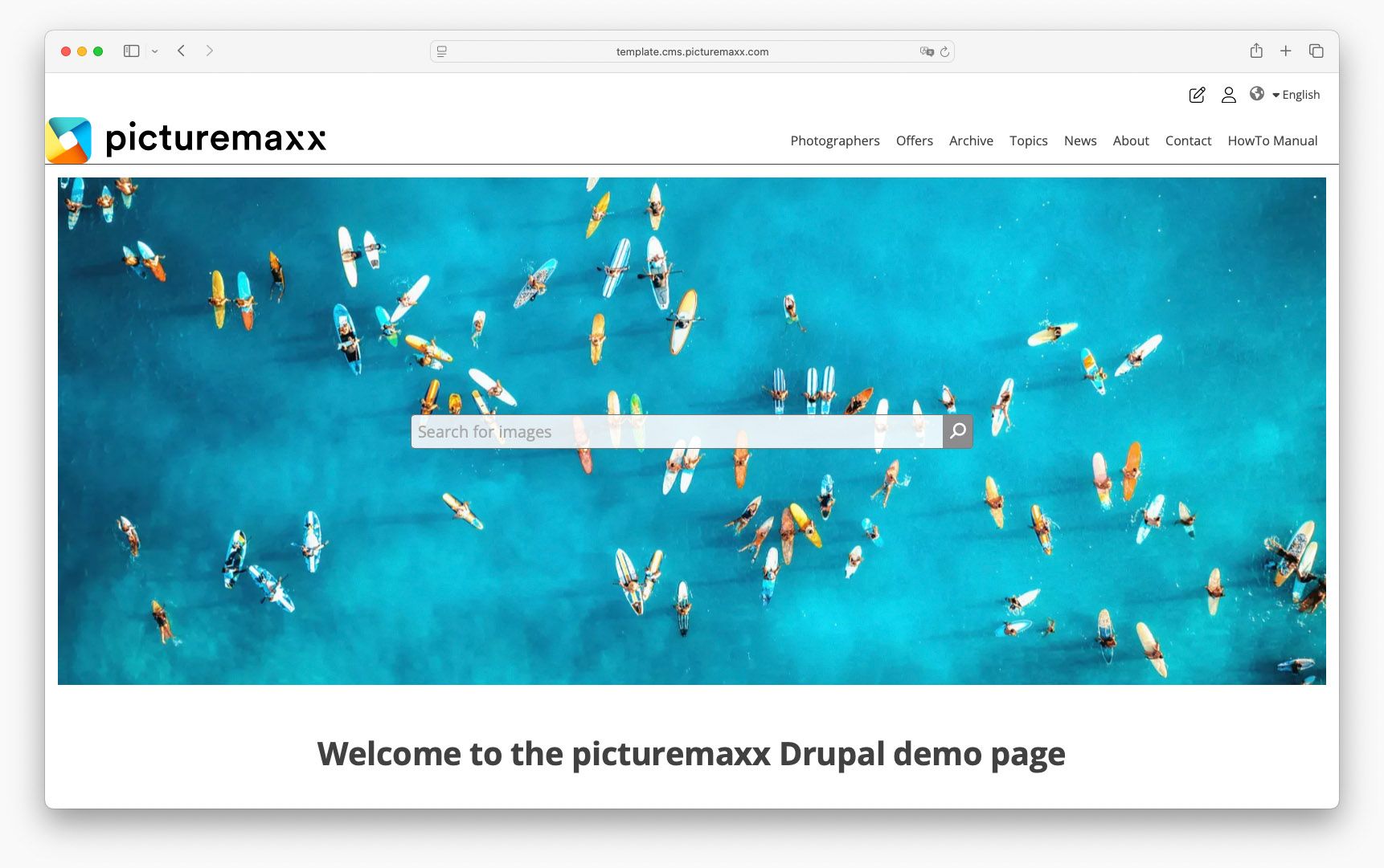
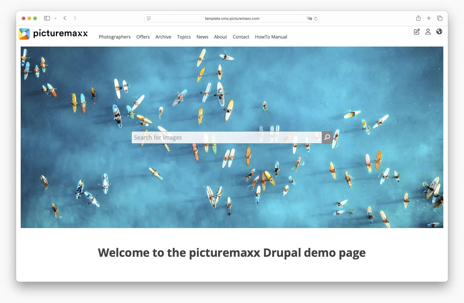
Functional Header and Footer menus are essential for the visitors to get an overview of your website content. Learn how to add links to these menus and optimize the display options that will benefit your visitors and search engines.
NOTE: Before you can add page links to the menus, you will need to build the pages. Find out how this works in the Basic Page section.
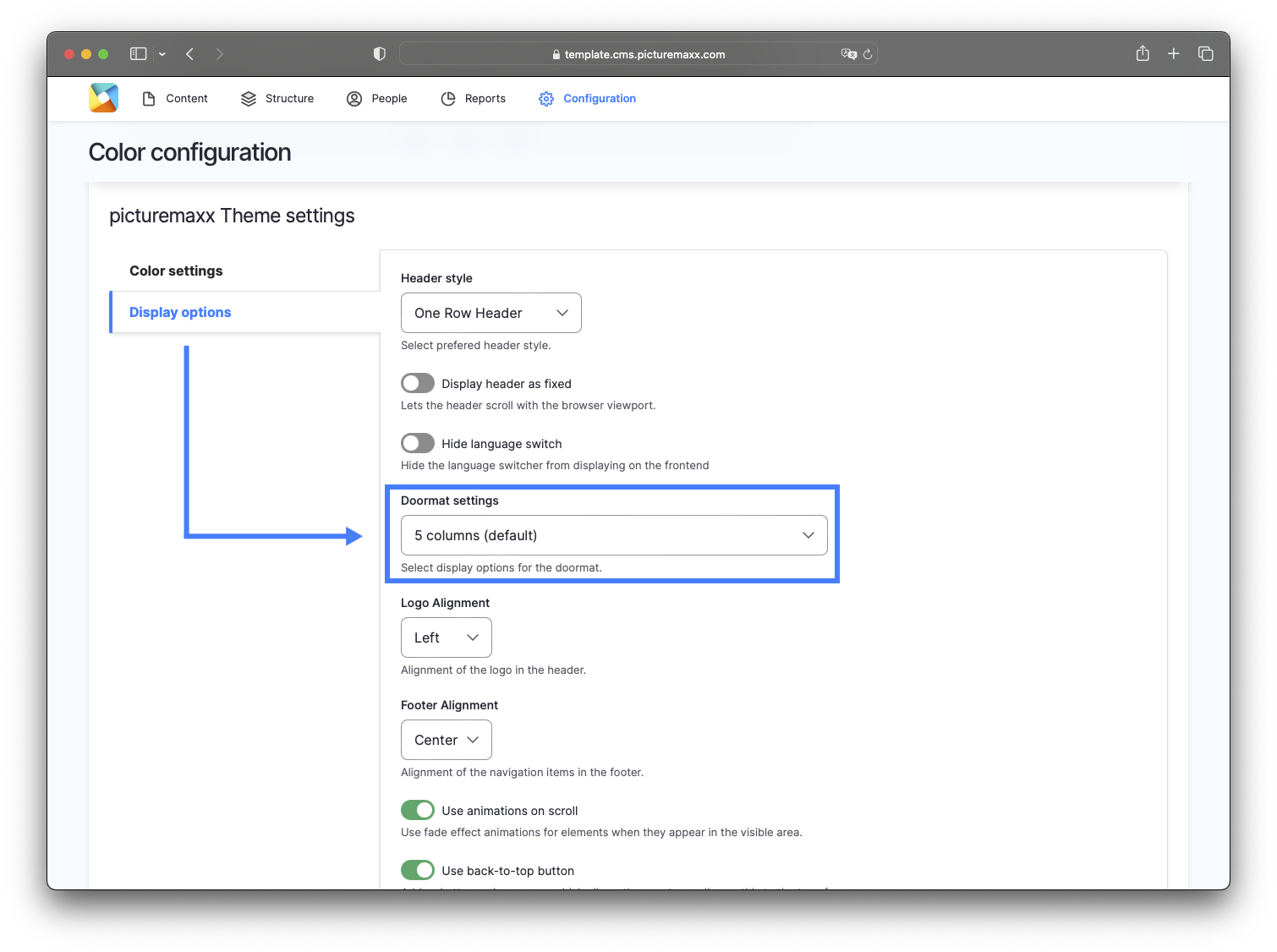
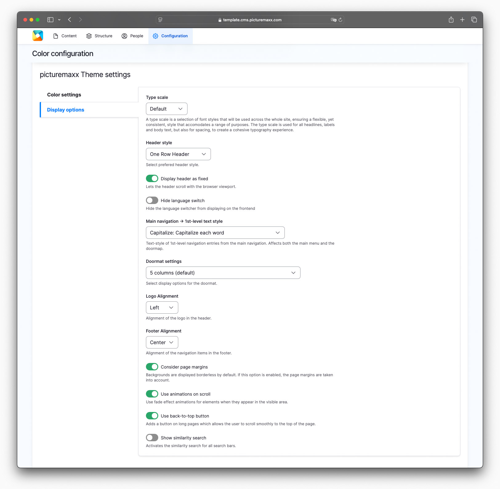
1. Display options
There are various options to configure the menus according to your needs.
- Navigate to Configuration → picturemaxx Configuration → Theme Settings → Colors, Logos & Styles.
- On the Color configuration page, scroll down to picturemaxx Theme settings and select Display Options.

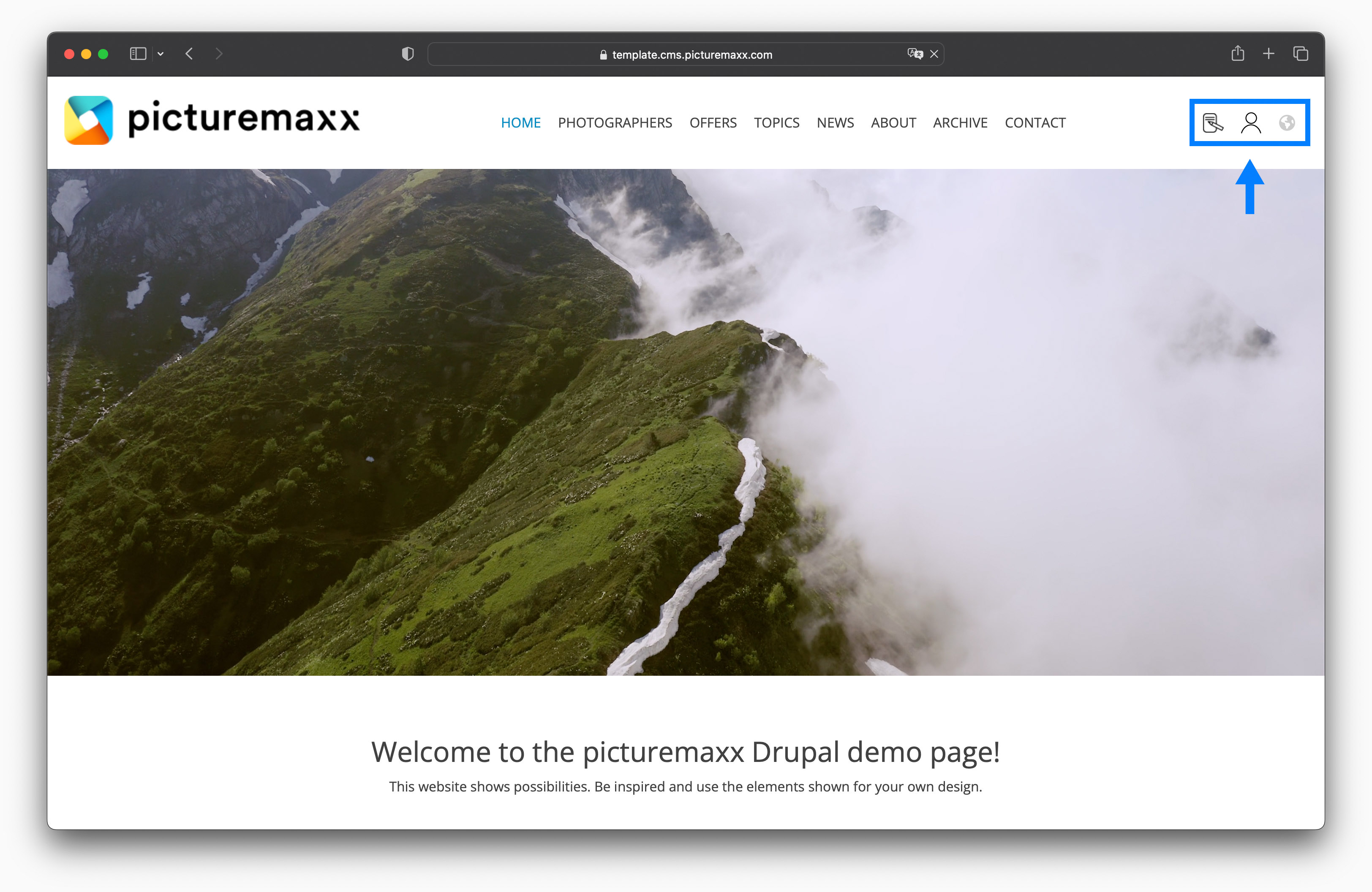
2. Edit menus
Menus help you effectively direct visitors to information that matters most on your website. The template offers various menu sections: header menu, main navigation, doormat, and footer menu. You can easily add a link to a menu by selecting Structure → Menus → Footer Menu, Main navigation, or Header Menu.
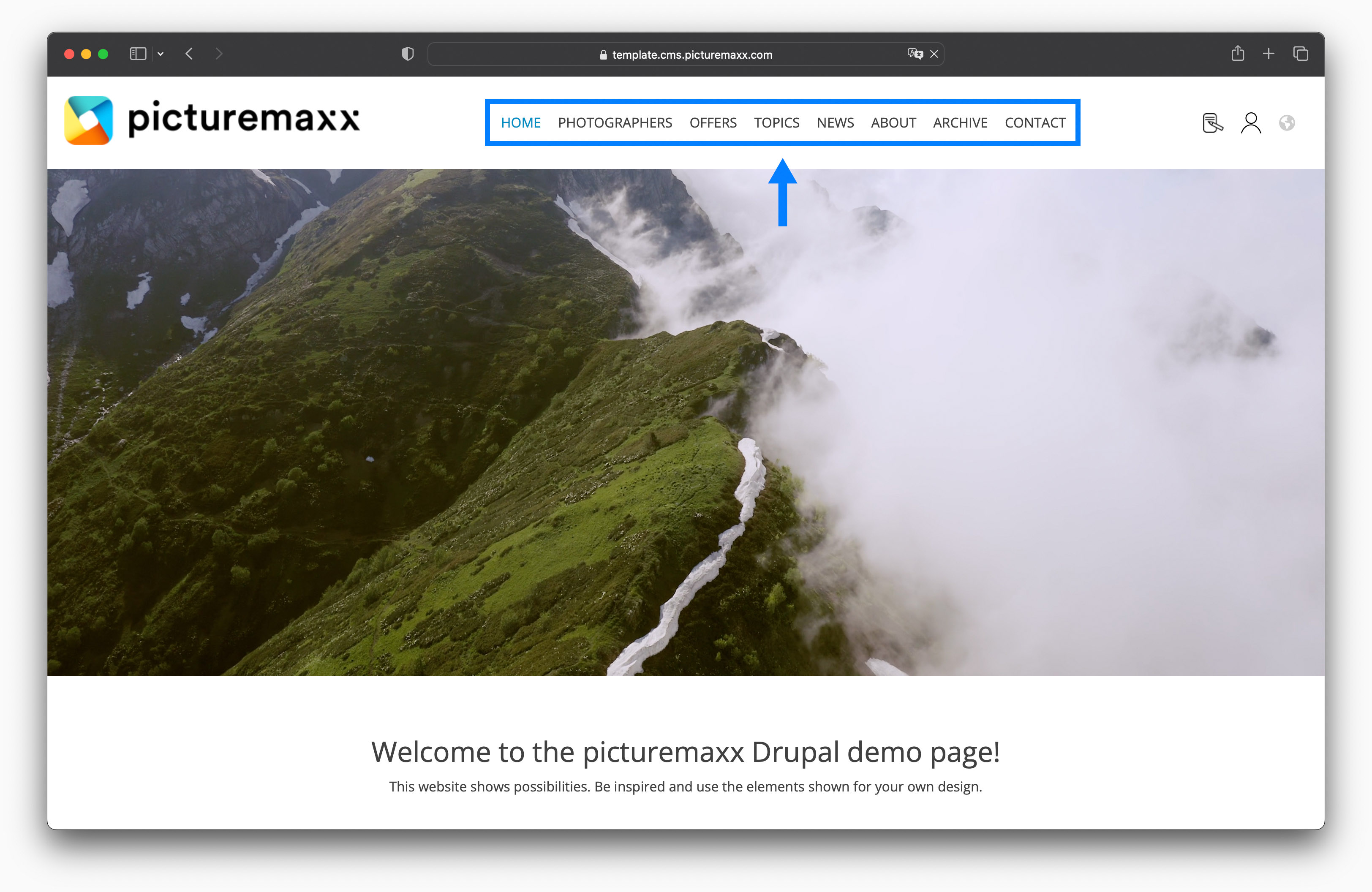
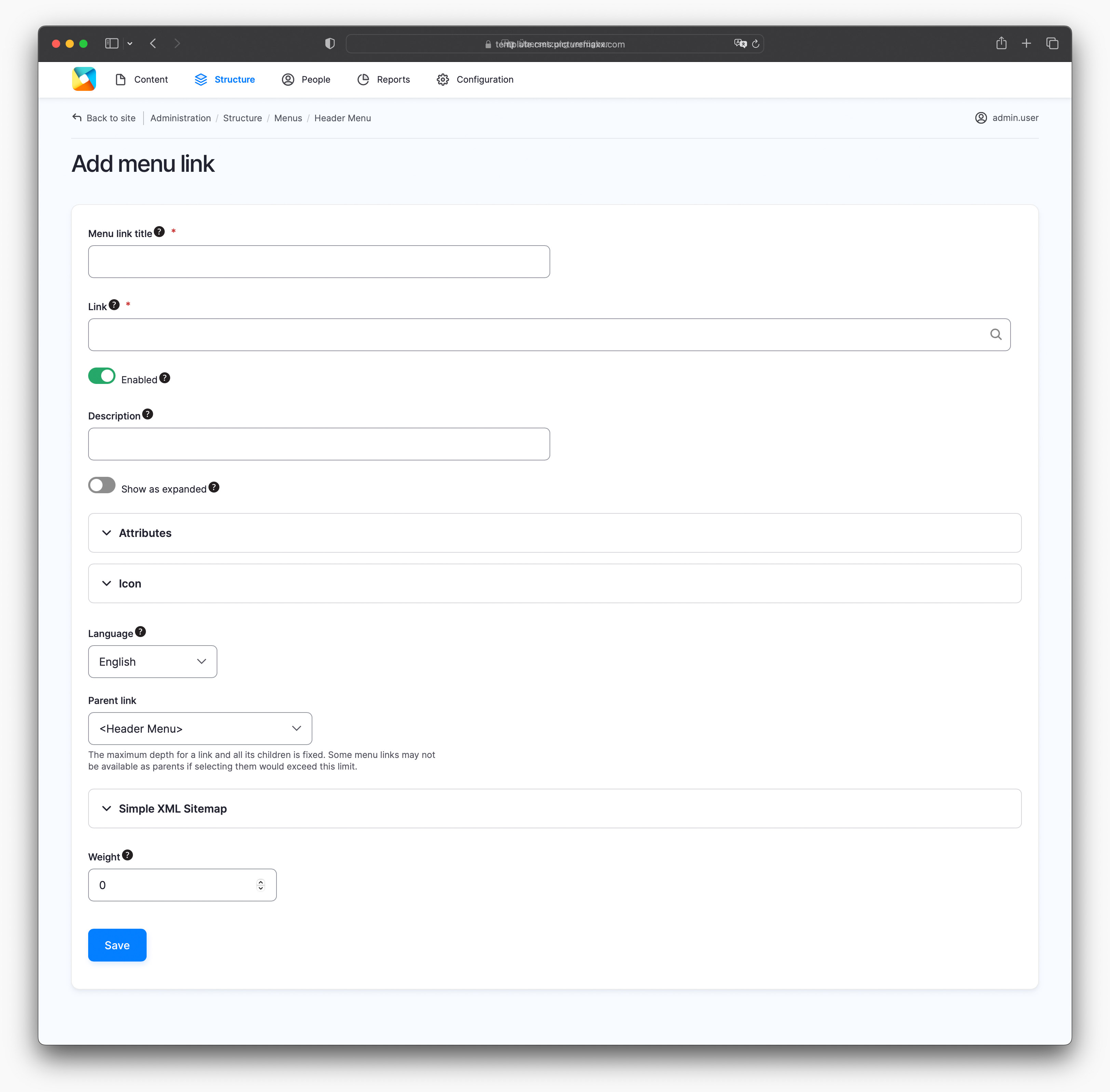
Add link to header menu
2.3 Dropdown menu
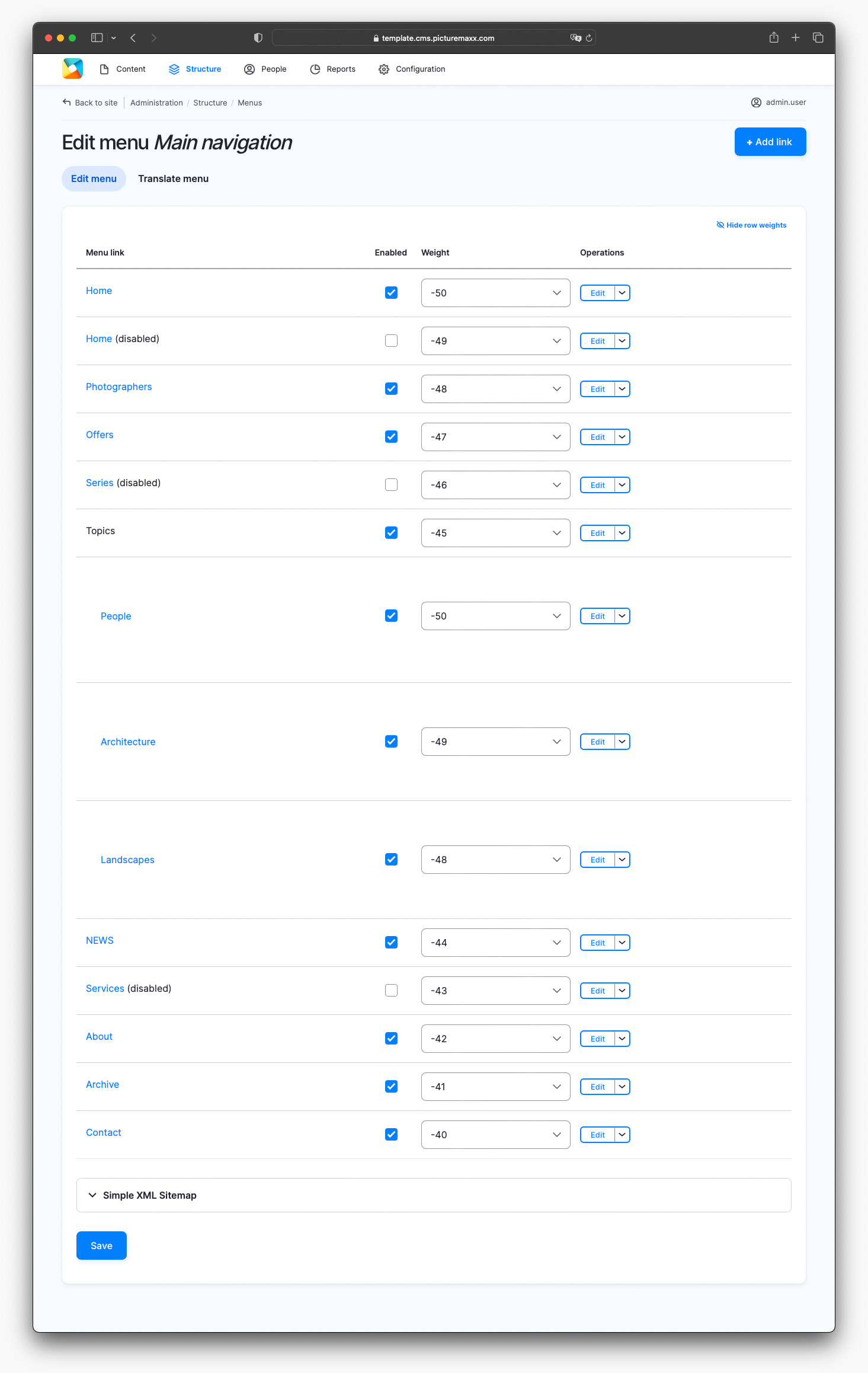
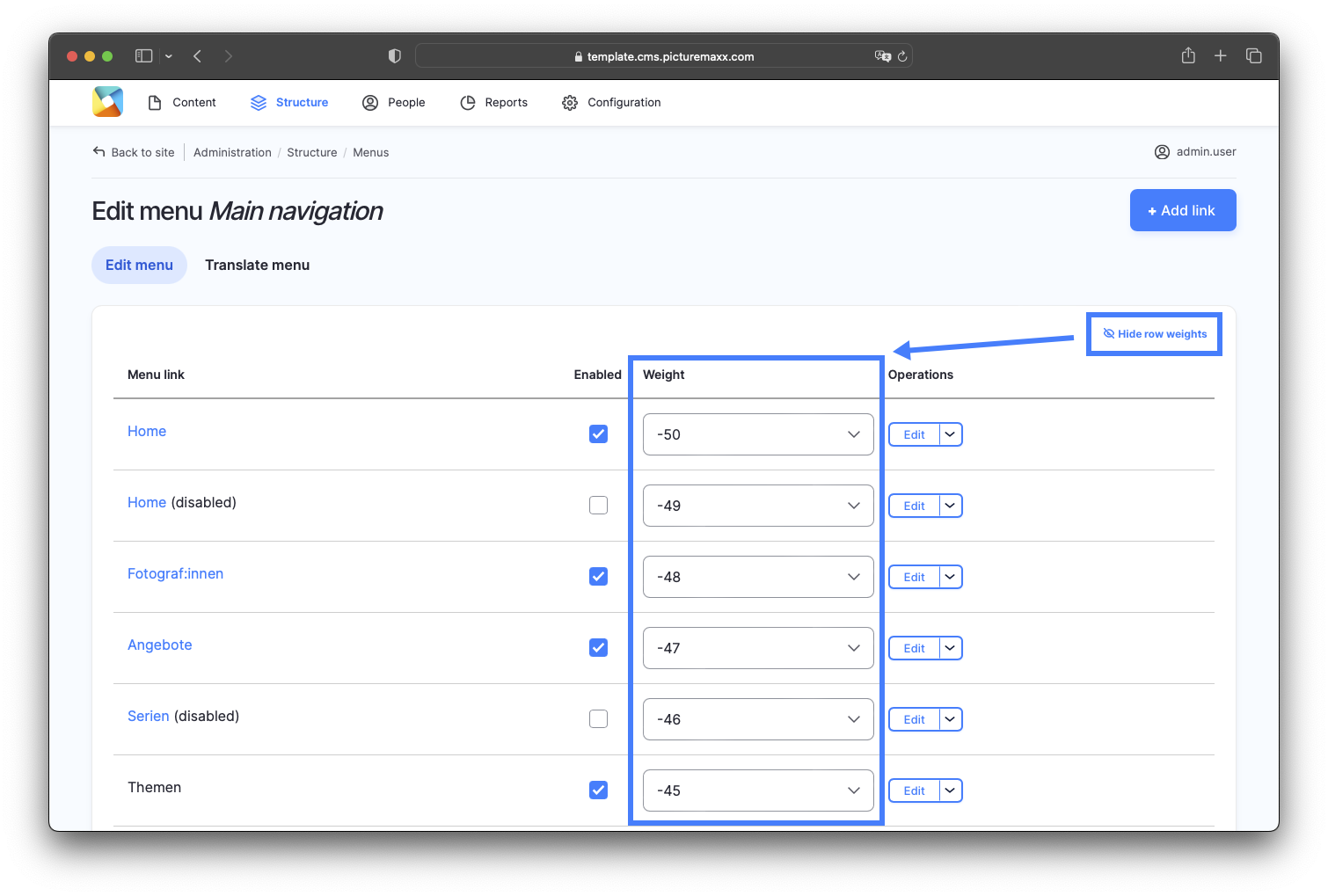
To change the structure and appearance of your menu, navigate to Structure → Menus → Main navigation. After you have created all menu items, you can change the order they appear in the menu:
- Drag a menu item to move it up or down in the list.
- Watch the video below to see how to move an item to a lower/higher level within the menu hierarchy.
- Reorder the menu items by weight with Show/Hide row weights.
- Click the Show row weights link to display the Weight column. Menu items appear in descending order according to their weight value. Sort the items by changing their weight values.
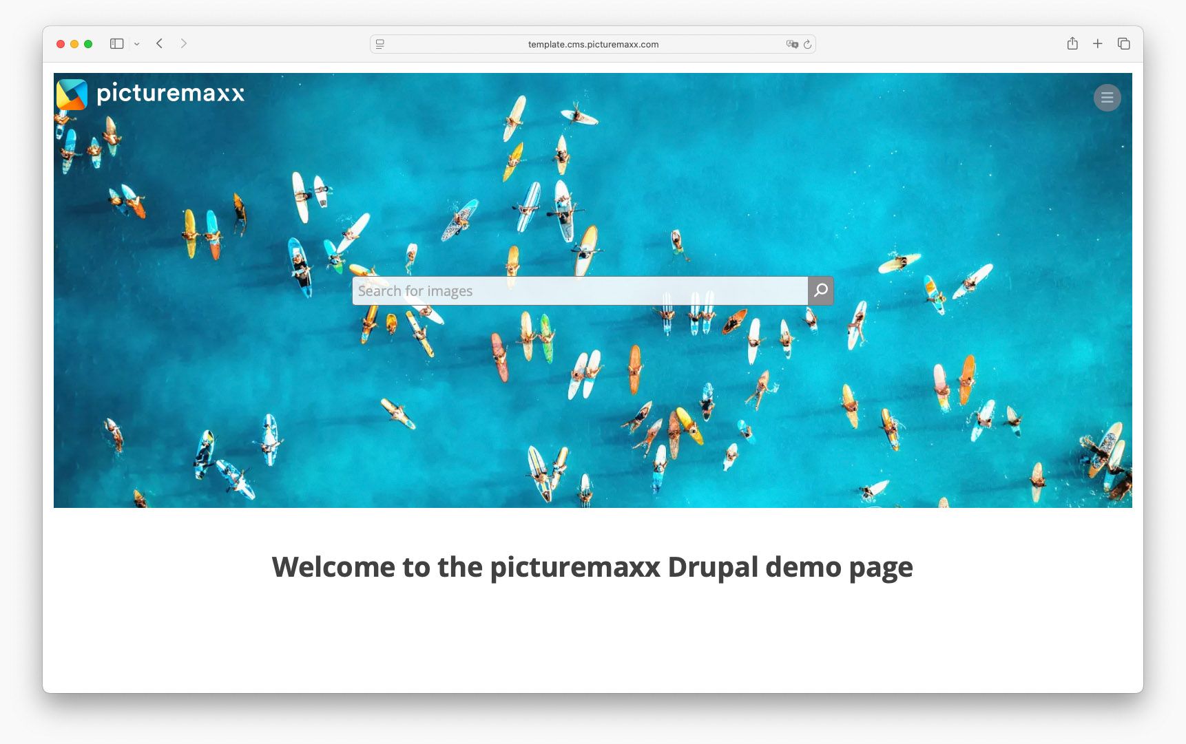
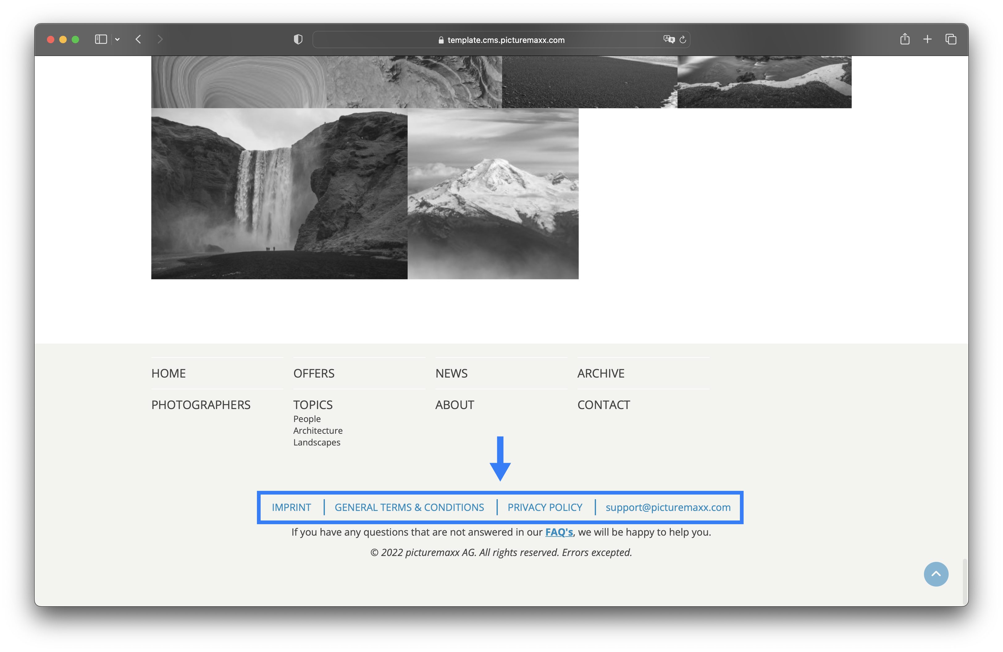
3. Doormat
The Doormat provides an overview of all menu items of your website, at the bottom of each page. Go to Configuration → picturemaxx Configuration → Theme Settings → Colors, Logos & Styles. Scroll down to picturemaxx Theme settings and select Display Options. Here you can specify how many columns the Doormat should have. If you decide against a Doormat, just select Hide doormat in the Doormat settings dropdown.