
Home → Organise your Media → Collections
Collections
The Collection paragraph type offers advanced functionality to design an image gallery for your website. You can configure display options and apply various layout types to style your image collection.
3. Display options
Choose from these display options and output styles to showcase your image collections.
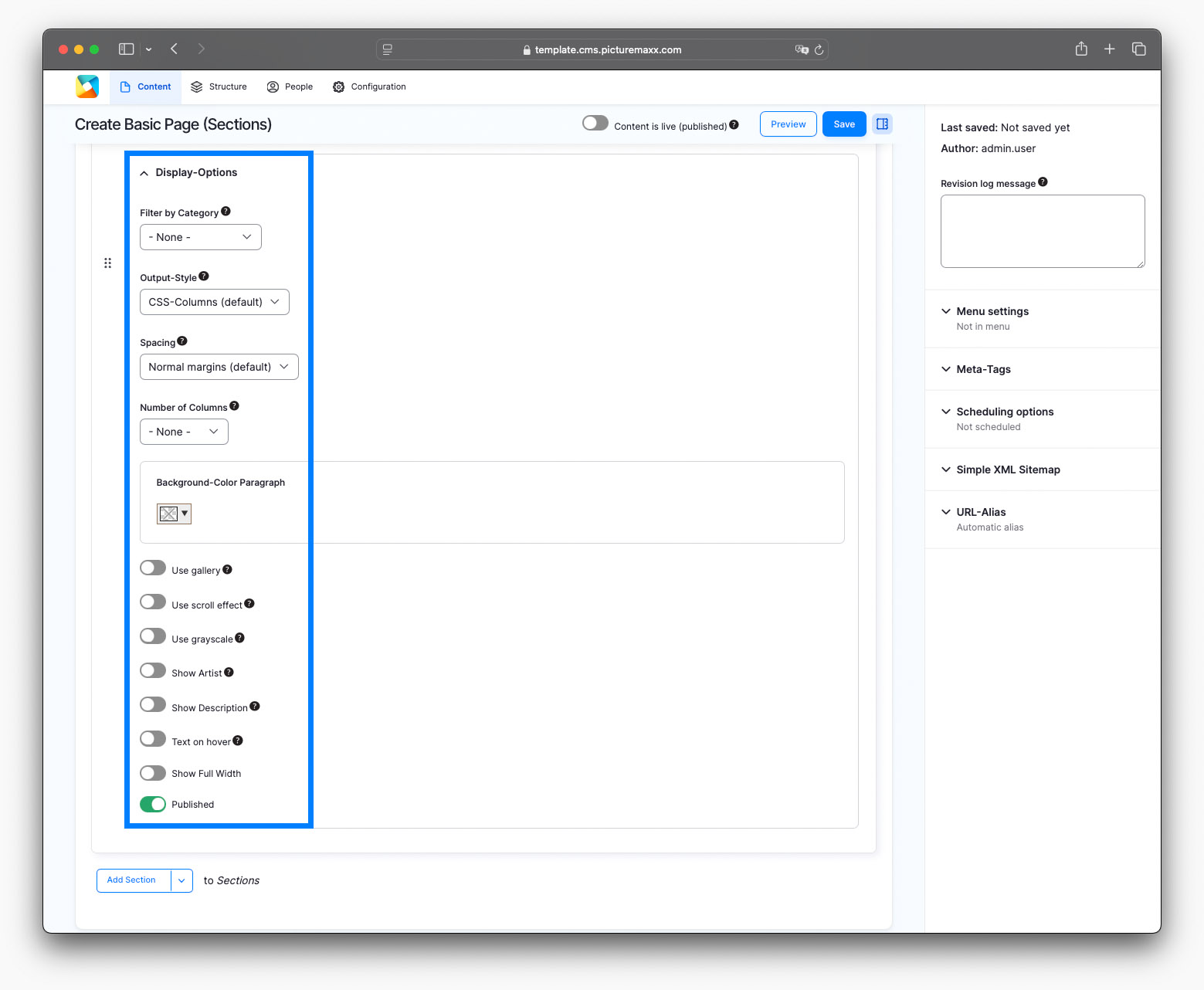
3.1. Output styles
-
Photo aspect ratio is used. The items go from top to bottom, not left to right.
Preview setup:
Spacing: normal margins
Number of columns: 4
Background: none
✔️ Use gallery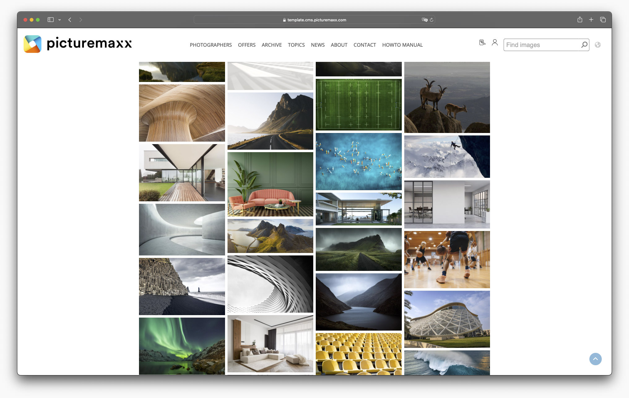
-
This output style offers a tiled look. Individual formats that step out of the line are placed prominently. The order is mostly horizontal, although the layout breaks with it in between.
Preview setup:
Spacing: small margins
Number of columns: 3
Background: none
✔️ Use gallery
✔️ Show full width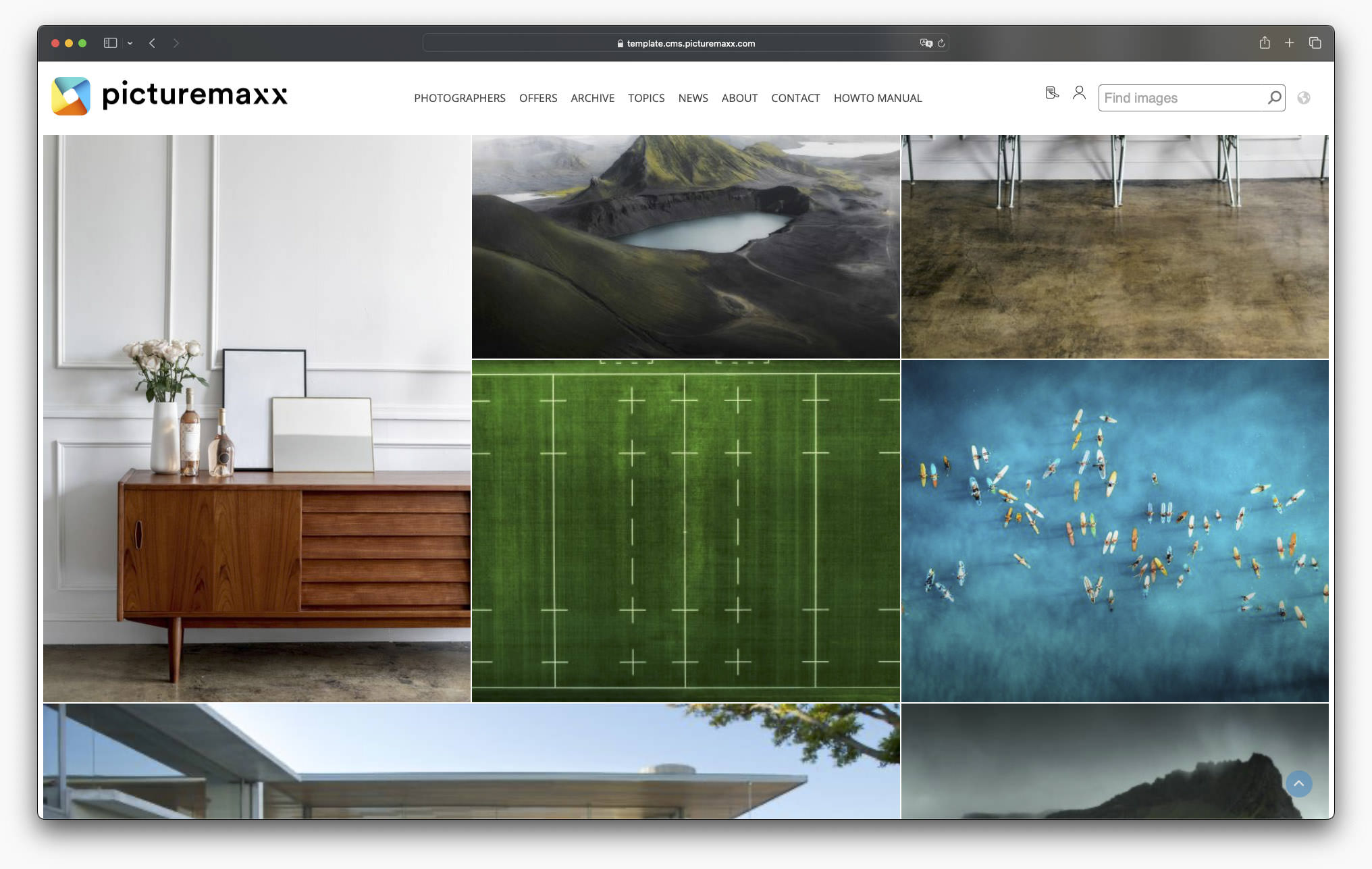
-
Photo aspect ratio is used. The items always go left to right. Gaps are not filled, so whitespace is used if there are different aspect ratios on a row.
Preview setup:
Spacing: wide margins
Number of columns: 4
Background: none
✔️ Use scroll effect
✔️ Show full width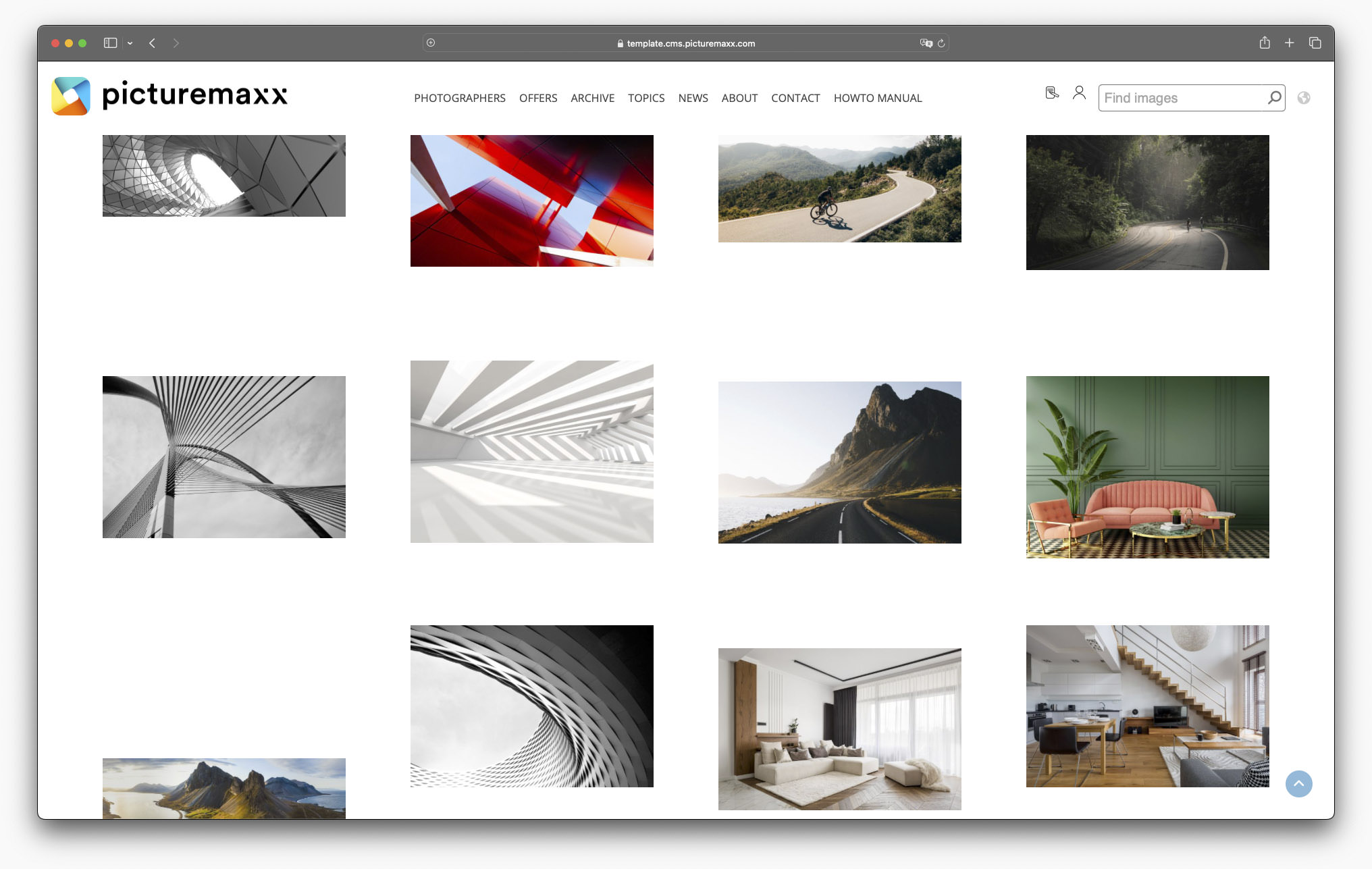
-
Photo aspect ratio is used. Images do not stick to a strict grid with gaps after smaller items, they move up and fill the gaps.
Preview setup:
Filter: Exposed Filter
Spacing: small margins
Number of columns: 4
Background: none
✔️ Use gallery
✔️ Show full width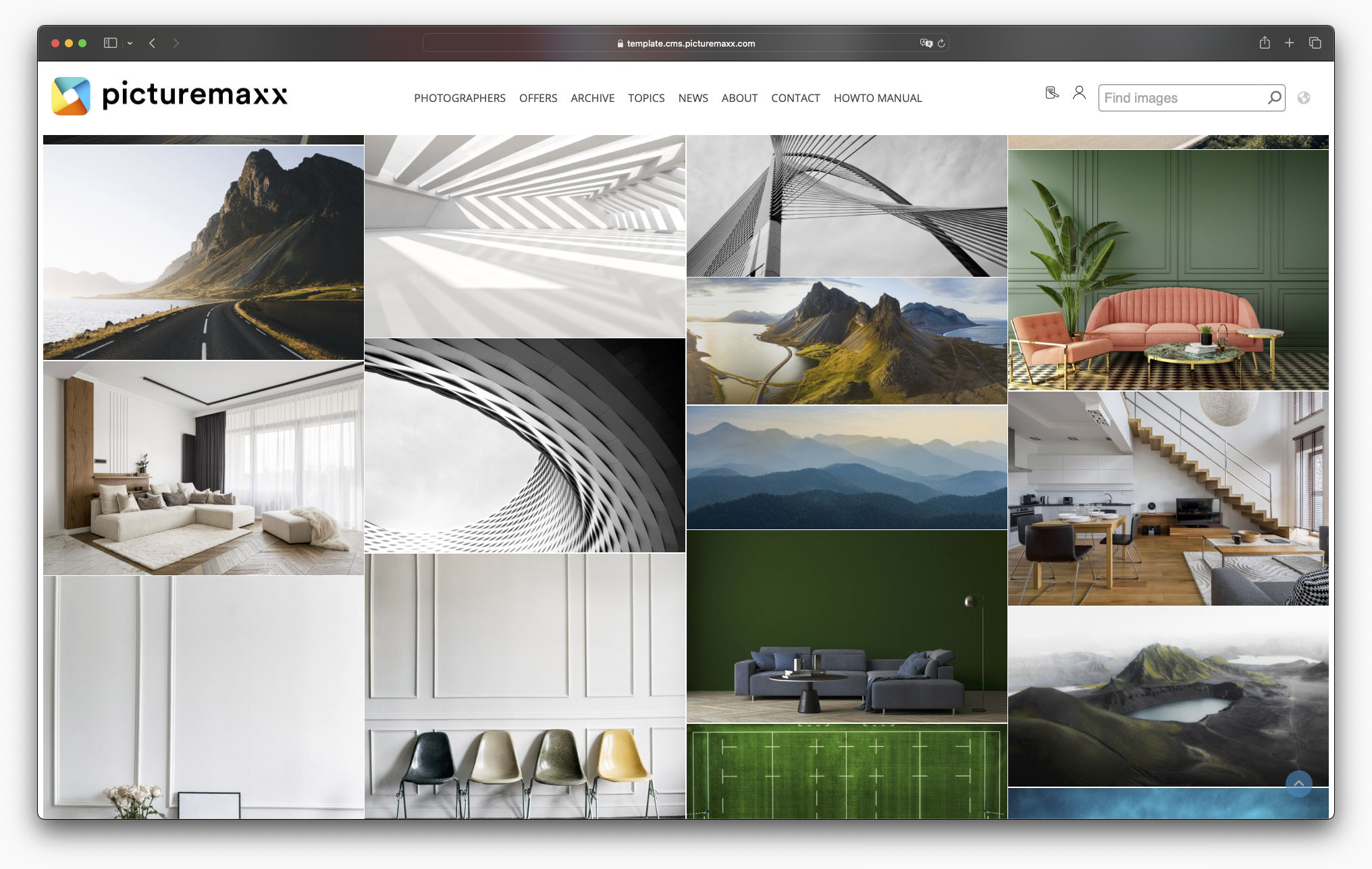
-
Photo aspect ratio is used. Images are arranged in an elegant way, a brick wall-like layout.
Preview setup:
Filter: Exposed Filter
Spacing: no space between images
Number of columns: 5
Background: none
✔️ Use gallery
✔️ Use gray scale
✔️ Show full width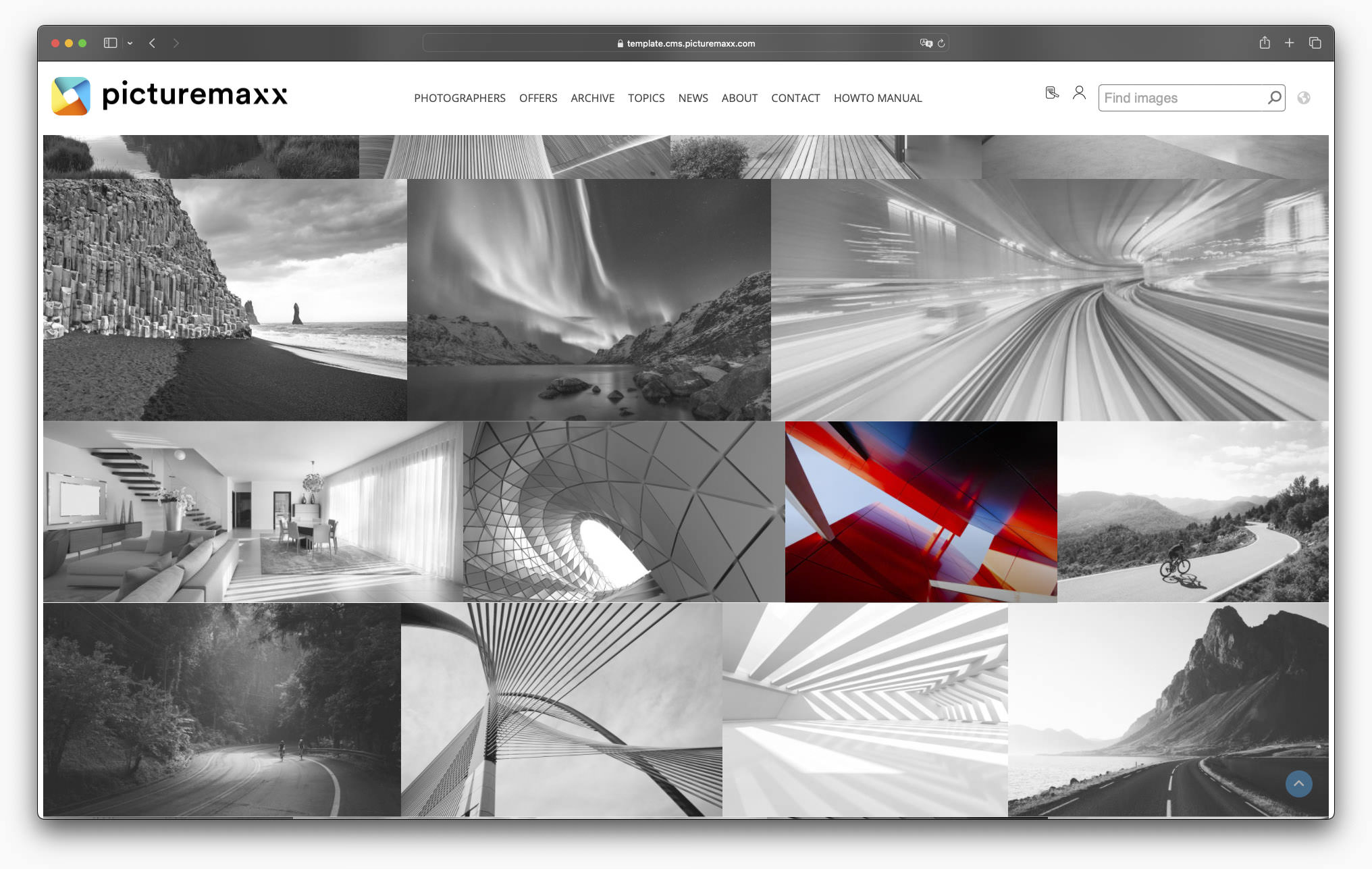
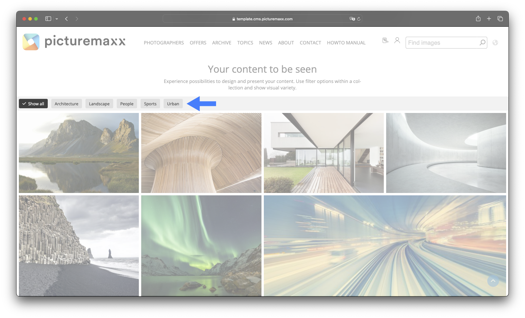
4. Add filter categories
You can activate the filter function for a collection and display specified categories above the gallery. If there are more than five filter categories, they are displayed as a dropdown menu. Give it a try on our demo page.
Important: The feature does not work with Scroll Effect activated.
Related content: To learn more about categories and how to assign images to specific categories, refer to Smart Linking.