
Home → First Steps → Block Layout
Block Layout
Block Layout helps create your overall page structure. Drupal offers a number of default blocks to be placed within the block layout. As these are not part of picturemaxx Drupal, please refer to Drupal's website for more information.
1. Why use blocks?
With blocks, you can manage the position of reusable page elements within the site layout.
-
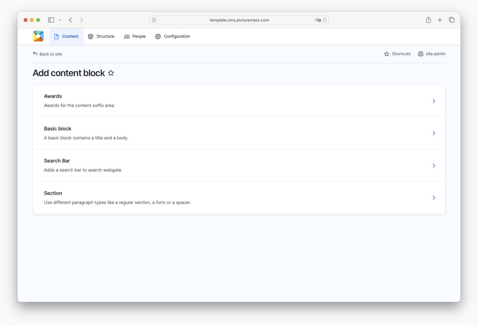
The Content block menu has the following block types ready for you (Content → Blocks → Add content block):
- Awards – allows granting awards for the content suffix area.
- Basic block – offers a basic layout that contains a title and a body.
- Search bar – adds a search bar for your webshop.
- Section – allows adding different paragraph types like a regular section, a form or a spacer.
Learn more about the regions in which the blocks are placed in the next step: 2. Block layout and regions

-
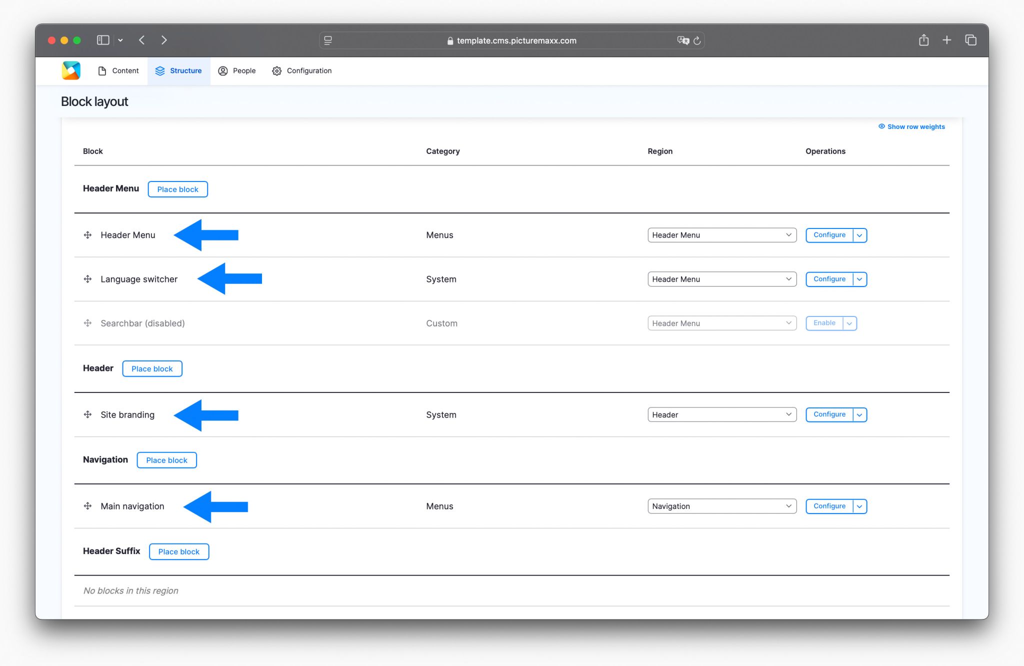
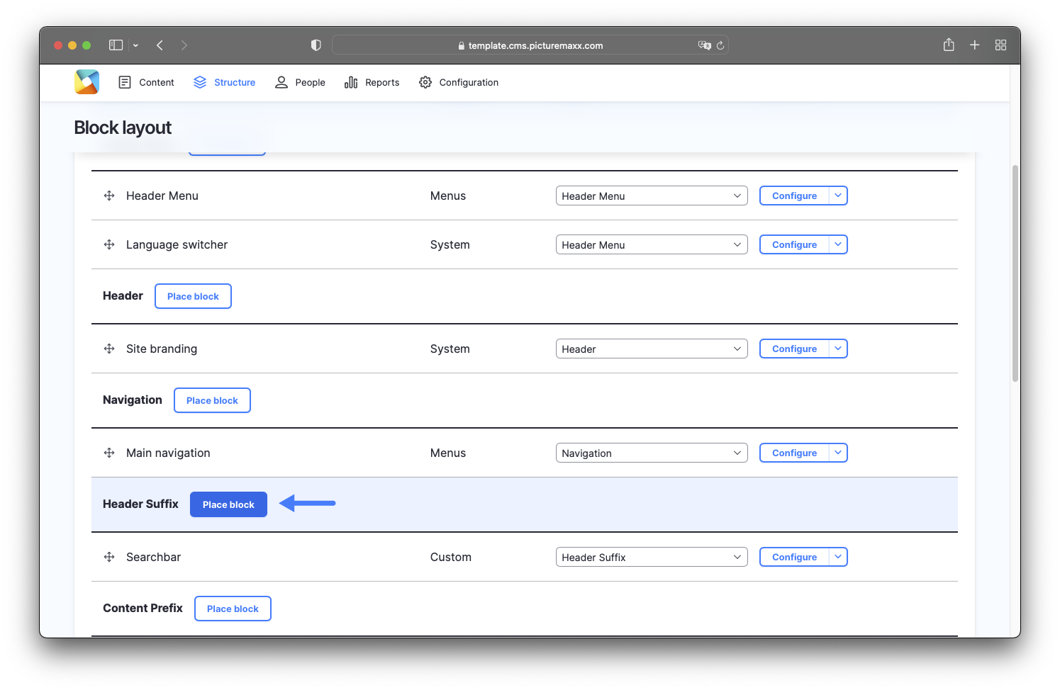
When opening the Block layout, you will find a structure that we have predefined to serve as a starting point for your website. Here you will also find some default blocks, for example:
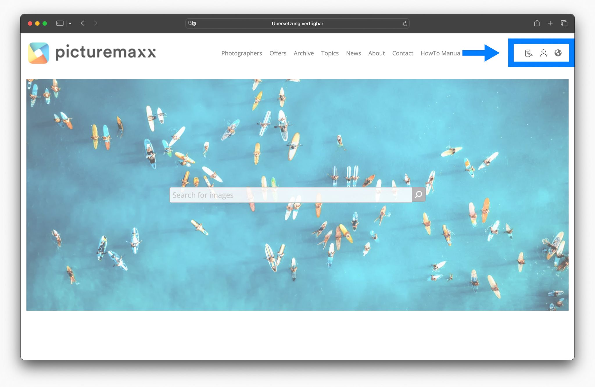
- Header Menu – Contains the login and registration links and icons (upper right corner of a web page).
- Language Switcher – We have placed the language switcher next to the header menu by default.
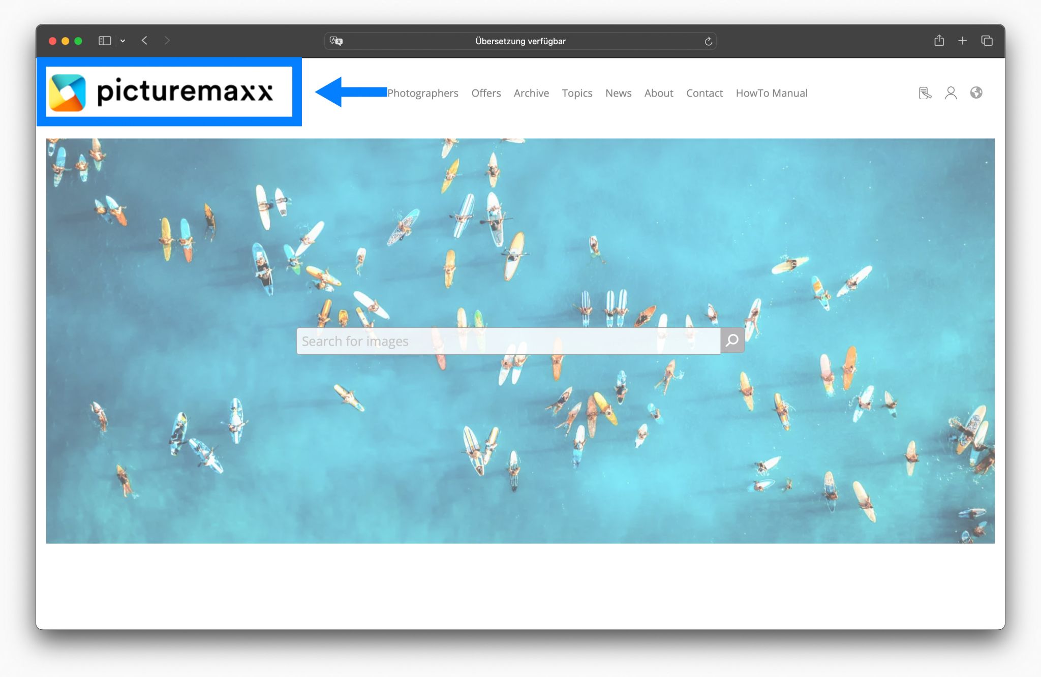
- Site branding – Contains the logo of your website.
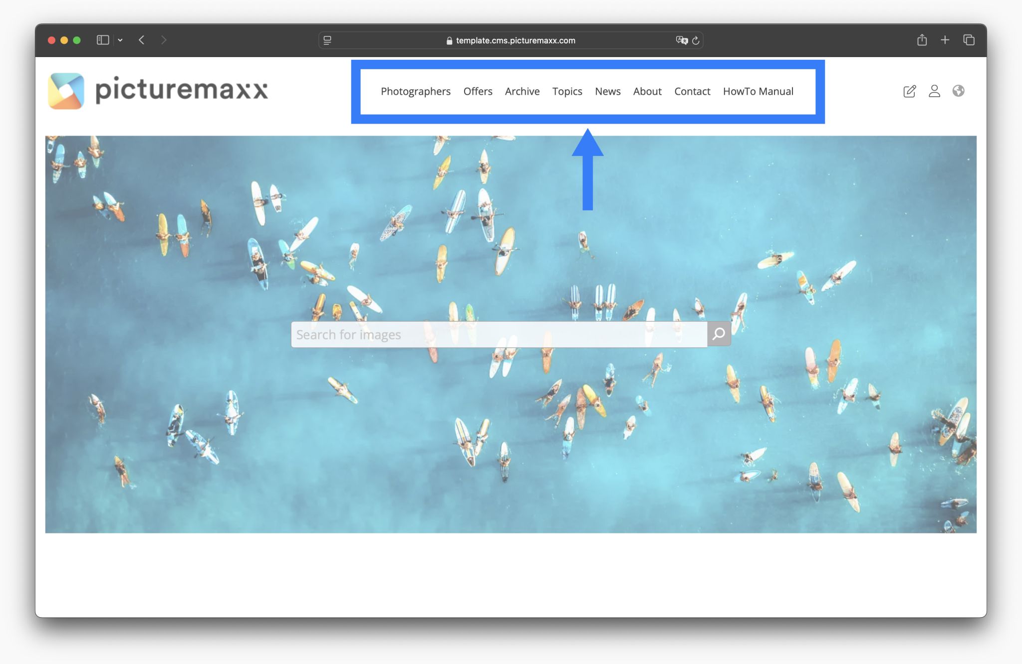
- Main navigation – We have placed the main navigation in Navigation by default.
Learn more about the regions in which the blocks are placed in the next step: 2. Block layout and regions
2. Block layout and regions
You can place blocks into available theme-dependent regions. Check out the tabs below (Header, Navigation, etc.) for the corresponding regions that are available for the picturemaxx Base Theme.
-
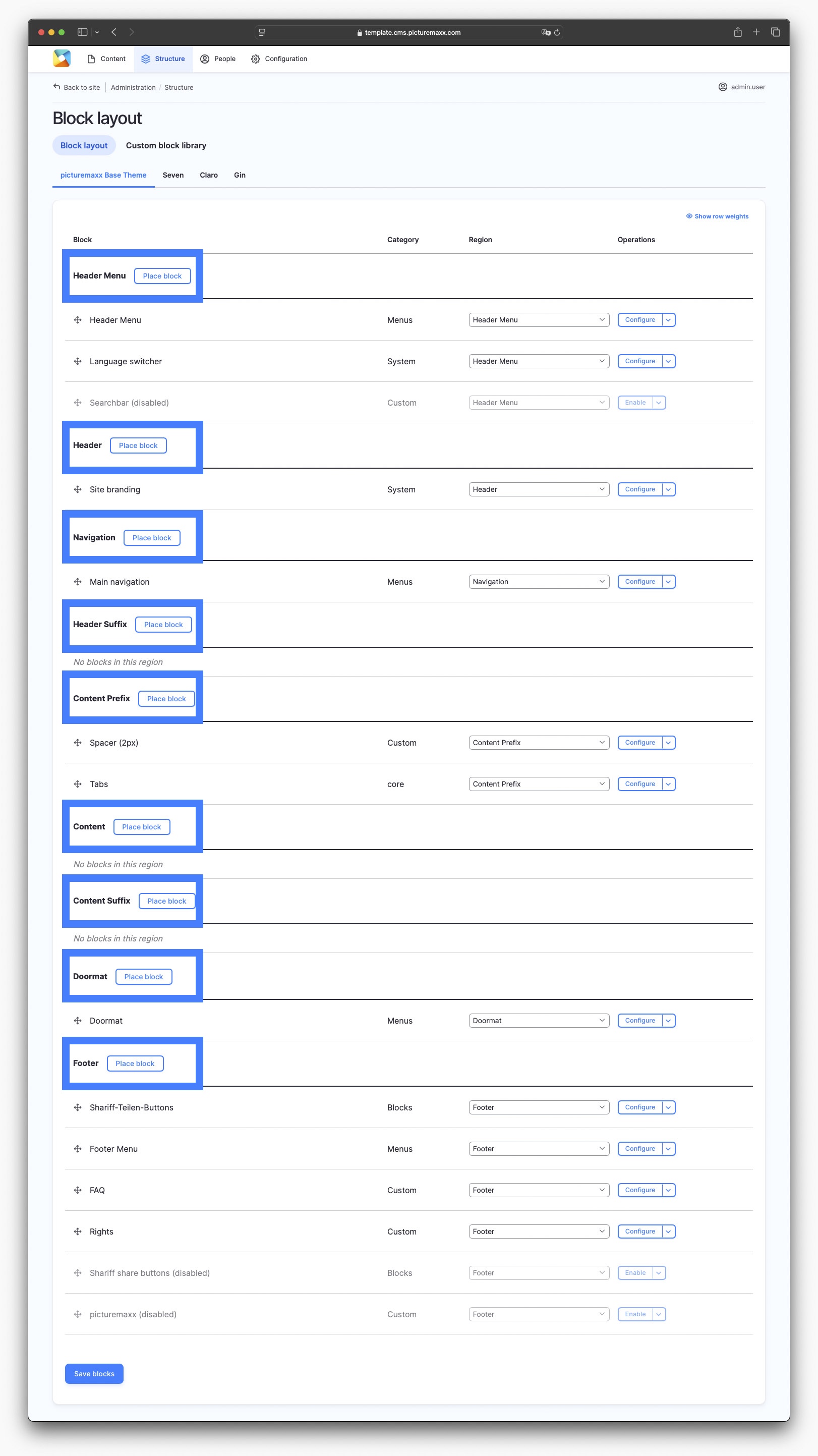
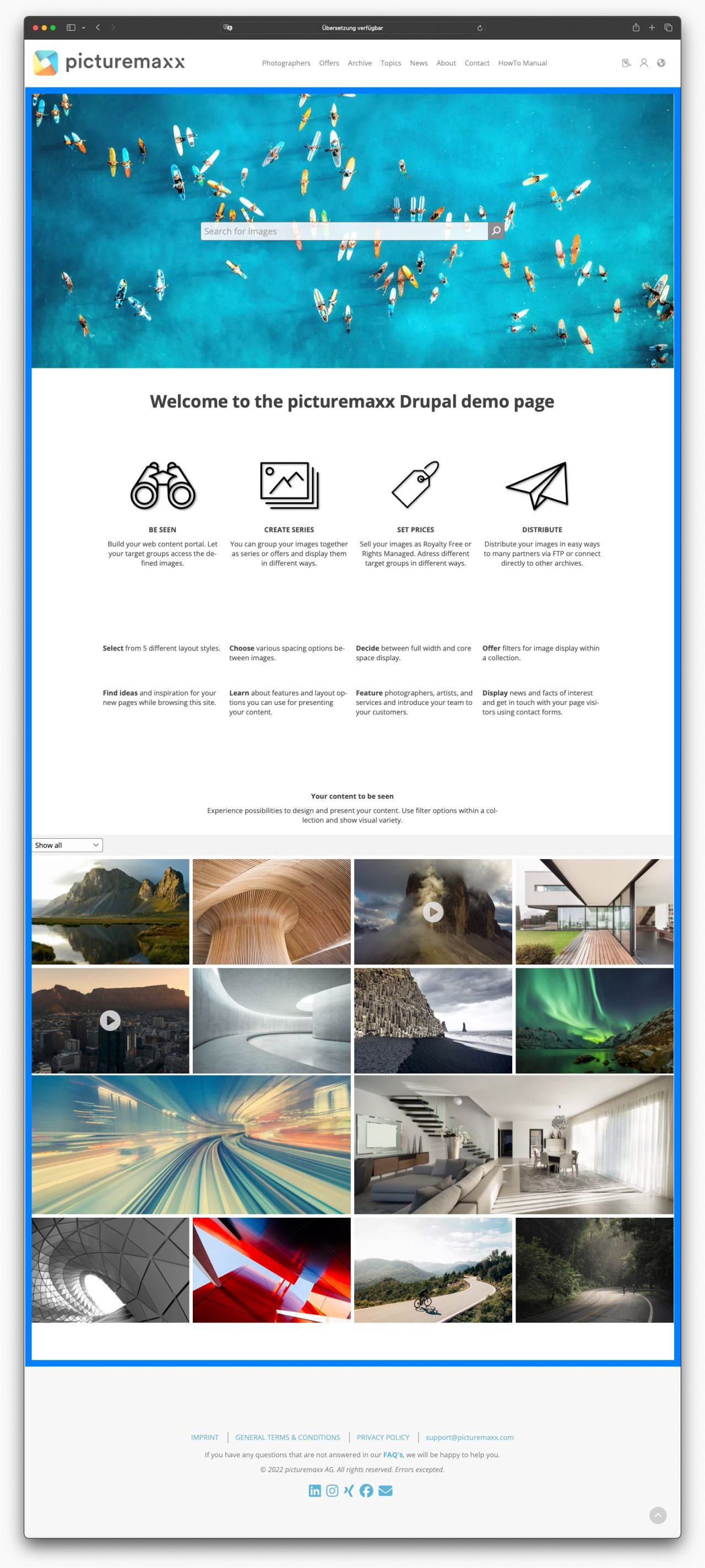
This is the Block layout setup page of the picturemaxx Drupal demo page:
-
The Header Menu and Language Switcher blocks are set in the Header Menu region by default.
-
The Site Branding block is set in the Header region by default.
-
The Main navigation block is set in the Navigation region by default.
-
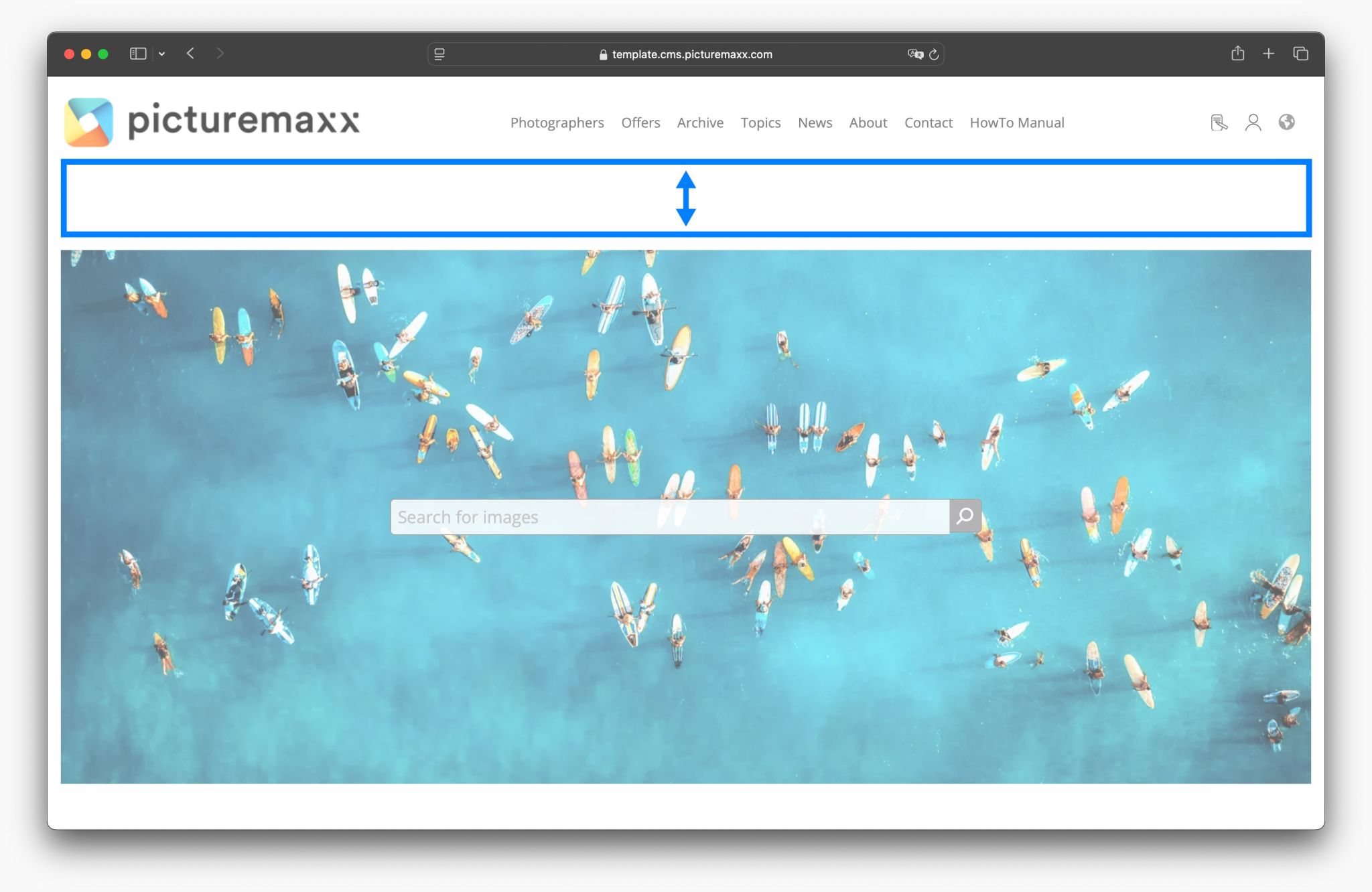
Header Suffix is an ideal region to place additional site elements (e.g. Search bar).
-
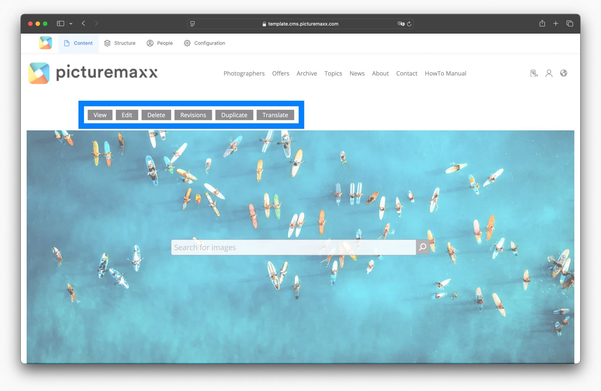
When you log in as Admin, the tabs of the content menu appear in the Content Prefix region.
NOTE: We do not recommend to change this setting.
-
As you can see in the Setup page screenshot, we have not placed any blocks in the Content area. This area is designed individually for most websites, so a standardized block rarely makes sense here.
-
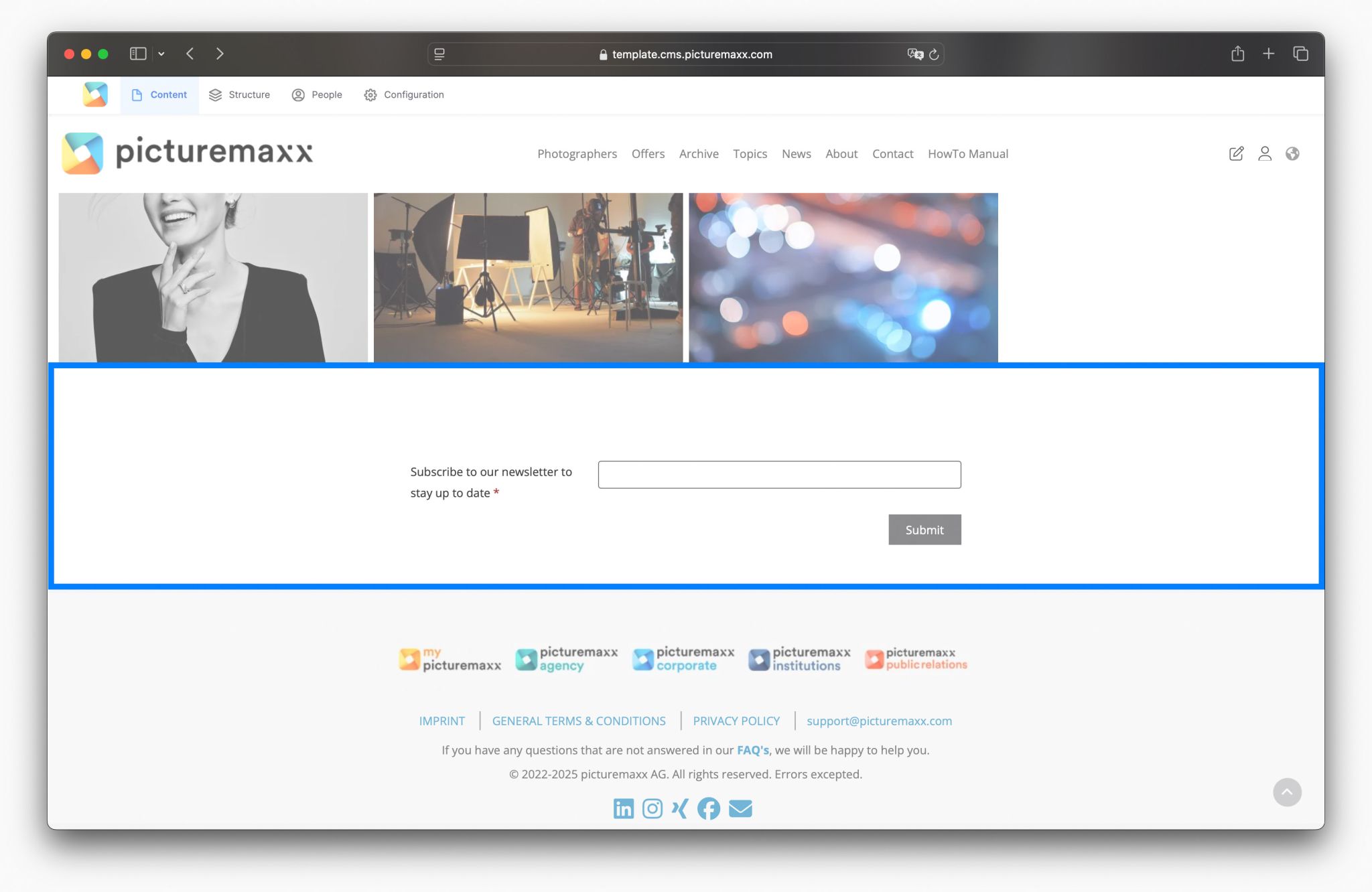
The Content Suffix area is ideal for placing Custom blocks. On the picturemaxx Drupal demo page we have decided to use a newsletter registration form.
-
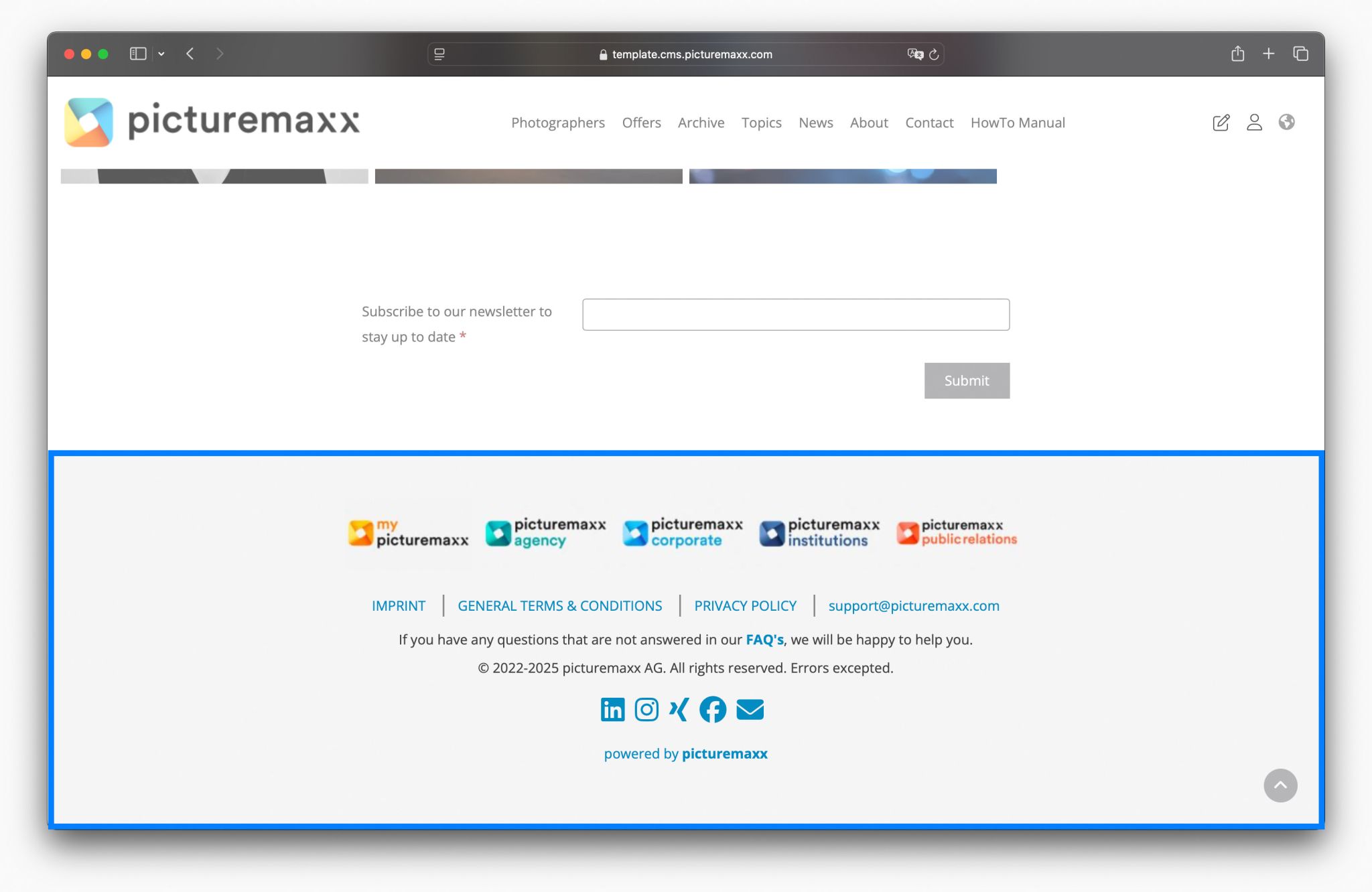
The footer of a website is the section you’ll find at the very bottom of a website. It usually stays the same on every page of the site and contains helpful information like contact details, links to important pages (like Privacy Policy or General Terms and Conditions), social media icons (Shariff Sharing Buttons), and sometimes a newsletter signup.
3. Place blocks
-
For example, to place Search Bar beneath the page header:
1. Click Place block next to Header Suffix.
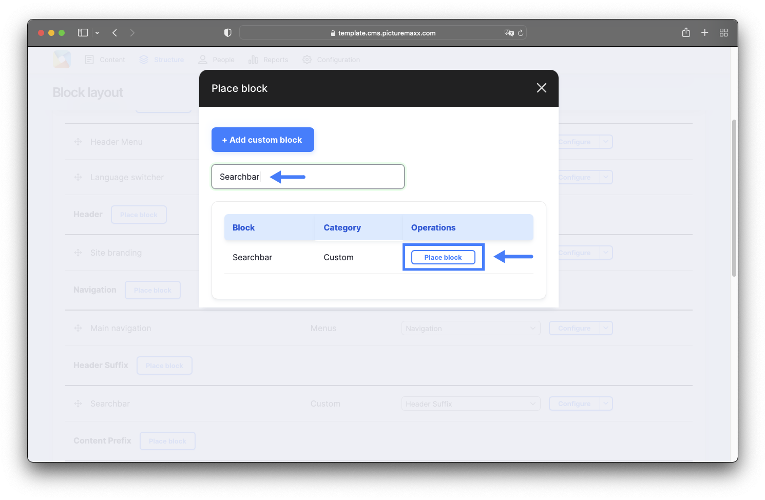
2. The Place block dialog lists all the blocks both offered by the system and custom-made by you. Find a required block and click Place block.
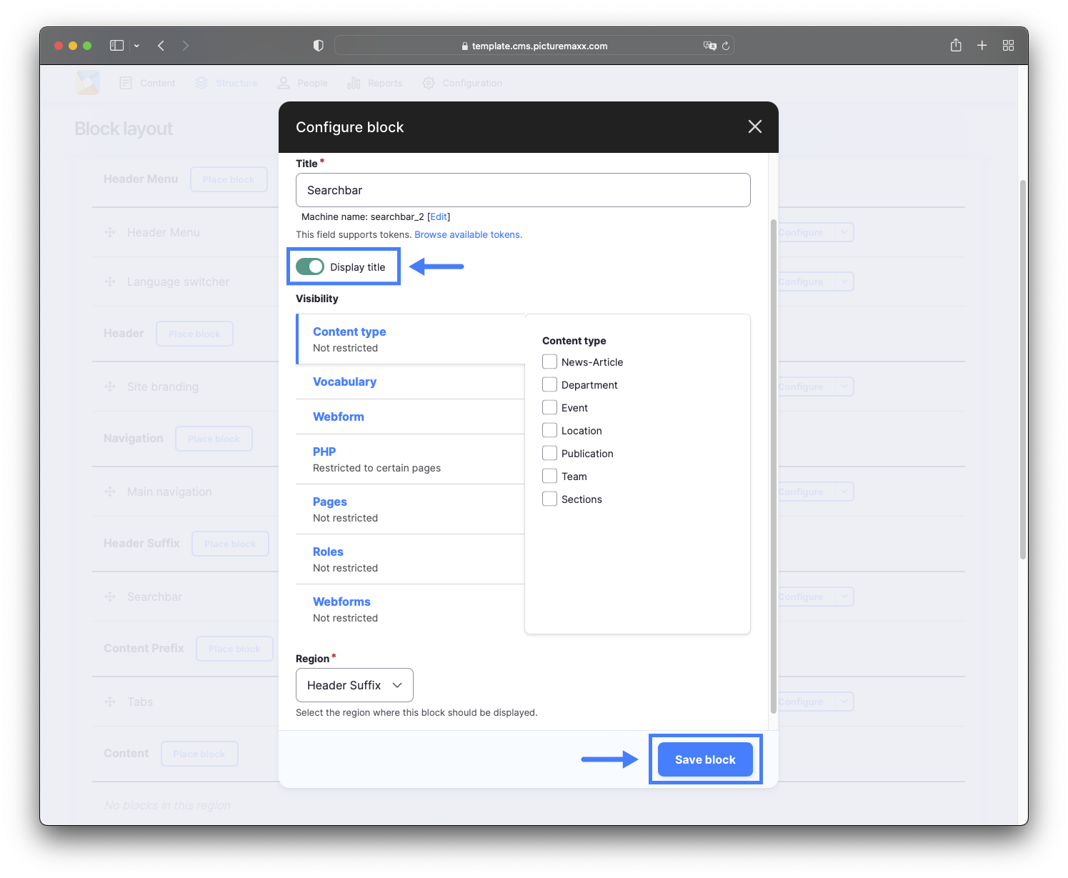
4. The Configure block dialog offers the following options:
- Display title to use the block name as the block's title on the page.
- Visibility to control the block's visibility for certain pages, roles, etc. If no changes are made here, by default, the block will appear on every page of your site. See 6. Configure visibility below.
- Click Save block to display the custom block within the selected region.
5. The Search Bar will now appear just below the main navigation on every page of the website.
5. Add content block: Search bar
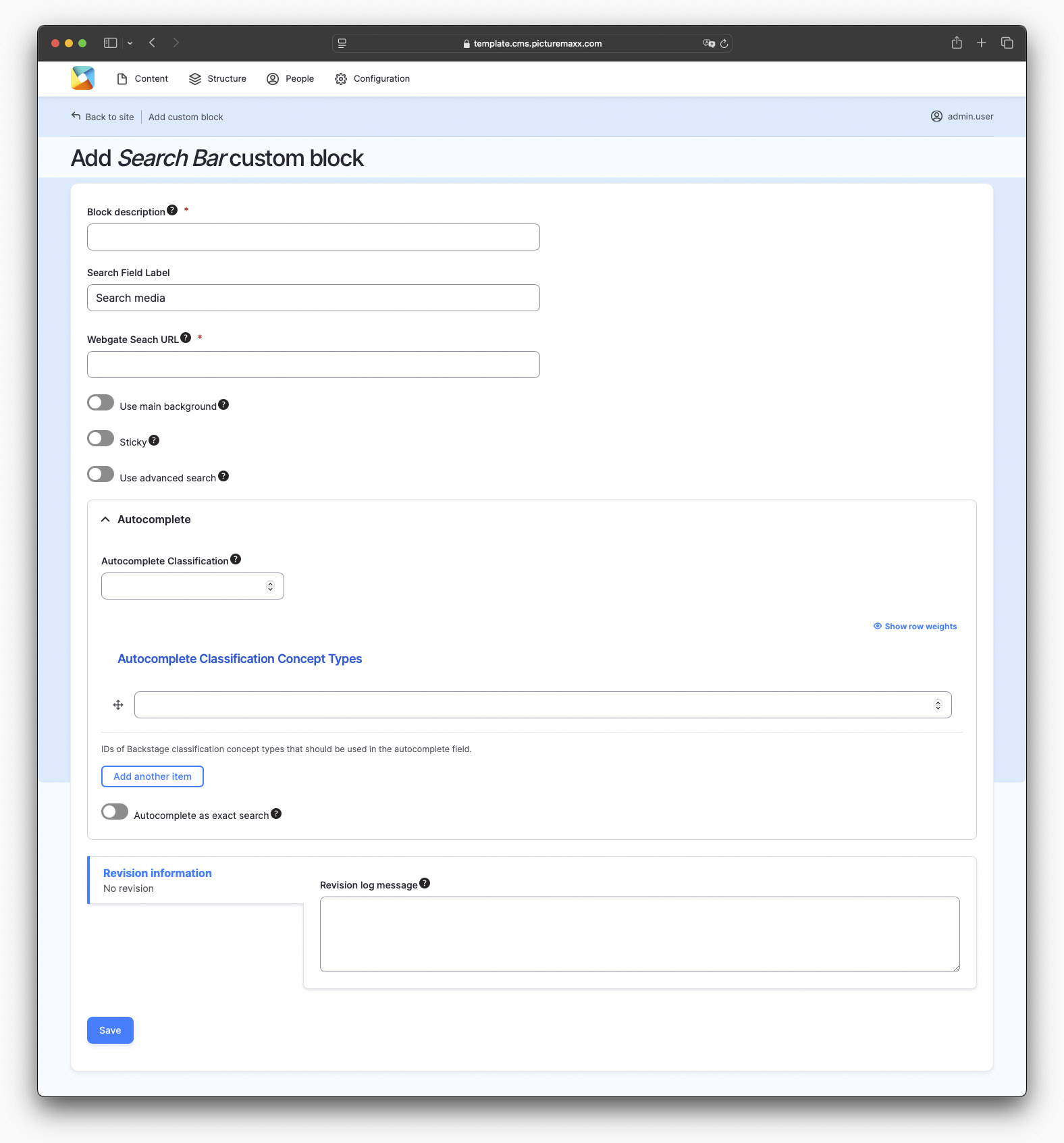
You can place a search bar to use it for your webshop. Navigate to:
- Content → Blocks → Add content block → Search Bar.
- Select the Search Bar option.
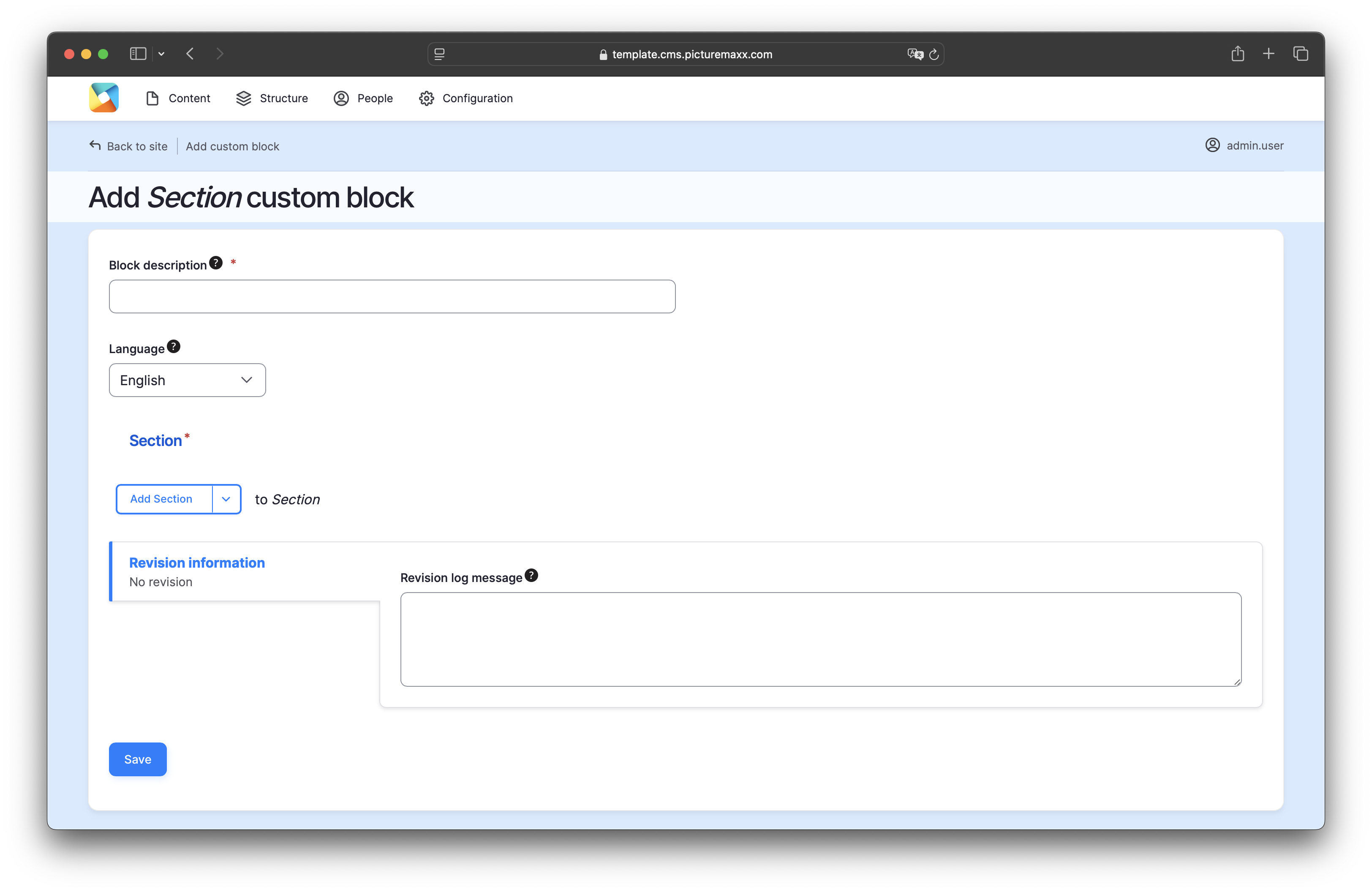
5.1. Add content block: Section
You can tailor a paragraph type (for example, Columns,Text & Media or Form) and use it across your website. To build a Section block, navigate to:
- Structure → Block layout → Add content block → Section.
- Select the Section option.